
The VIX Isn't What You Think It Is
How the VIX-to-VIX1D spread tells you what the market fears — and when

Most retail traders think the VIX is a “fear gauge.” It goes up when stocks go down. Simple. But that understanding is dangerously incomplete — and right now, the VIX is telling a story that the headline number alone doesn’t reveal.
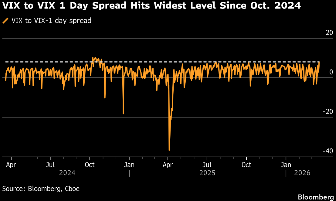
Today I want to walk you through a chart from my Bloomberg Terminal that captures something institutional traders obsess over but most investors have never heard of: the VIX-to-VIX1D spread. It just hit its widest level since October 2024. Here’s why that matters.
First, What Is the VIX — Really?

The VIX measures the market’s expectation of volatility over the next 30 days. It’s derived from S&P 500 options prices. When traders buy more puts (downside protection), those options get more expensive, and the VIX rises. When traders are complacent, puts are cheap, and the VIX falls.
But here’s the nuance: the VIX is a 30-day average expectation. It doesn’t tell you whether the market is scared about tomorrow or scared about three weeks from now. That distinction is everything.
Enter the VIX1D — a newer index that measures expected volatility over just the next single trading day. It was introduced by the CBOE in 2023 and gives us a real-time read on how anxious the market is about the immediate future versus the medium-term.
The Spread: Where the Signal Lives
When you subtract VIX1D from VIX, you get the VIX-to-VIX1D spread. This tells you something simple but powerful:
Positive spread (VIX > VIX1D): The market expects MORE volatility in the coming weeks than it does tomorrow. Traders see event risk ahead but aren’t panicking yet.
Negative spread (VIX < VIX1D): The market is more afraid of TOMORROW than the next month. This only happens during acute panic events.
Think of it like a yield curve, but for fear. “Contango” means forward fear exceeds spot fear. “Backwardation” means today’s fear exceeds forward fear. Just like an inverted yield curve signals recession, an extreme reading on the VIX spread signals a regime shift in volatility.
Reading the Chart
The Bloomberg chart shows this spread from early 2024 through today. Three features stand out.
The baseline band. For most of the chart’s history, the spread oscillates in a tight range between roughly -5 and +5. This is “normal” — near-term and medium-term fear are aligned. The dashed line near +7 marks the upper boundary. When the spread pushes above it, something unusual is happening.
The April 2025 crash. The most dramatic feature is the plunge to approximately -40 in April 2025. That was the tariff shock — an acute, immediate panic event. VIX1D (single-day fear) massively exceeded VIX (30-day fear). The market was saying: “Today might be catastrophic, but we’ll figure it out over the next month.” That kind of extreme negative reading is rare and typically marks a capitulation point. Notice the spread snapped back to normal within days. Acute fear burns out fast.
Right now. Today’s reading is the opposite. The spread has pushed to its widest positive level since October 2024. The market is telling you the next 30 days contain significantly more risk than tomorrow. This is anticipatory fear — not panic, but preparation.
Why This Matters
The timing is important. Tomorrow (March 20) is a major options expiration, and April has historically been a re-risking window after quarterly OpEx. The vol term structure is saying the March OpEx might act as a temporary pin — holding prices steady through expiration — but the market expects turbulence immediately after.
The last time the spread was this wide was October 2024, right before the November election. Another period where traders could see a binary event on the horizon and were positioning weeks in advance. The spread normalized after the event passed.
The message is consistent: wide positive spreads precede event-driven volatility. They don’t tell you which direction the market will move, but they tell you it’s likely to move a lot.
Connecting the Dots
This signal doesn’t exist in isolation. Other data from the Terminal this week tells the same story:
High-yield bond funds have seen six straight weeks of outflows, the largest in 11 months. Credit markets are de-risking.
The 2s10s yield curve has flattened to 43.5 basis points, its narrowest since April. The bond market is pricing economic deceleration.
Defense spending is concentrating into a handful of prime contractors — the government is prioritizing security even as the broader economy shows stress.
All of these point the same direction: the market is transitioning from complacency to anticipation. The VIX-to-VIX1D spread is just the clearest single chart that captures that shift.
Key Takeaways
The VIX alone is incomplete. The VIX1D and the spread between them reveal HOW fear is distributed across time.
Today’s wide positive spread means the market sees event risk in the coming weeks but isn’t panicking about tomorrow.
Historically, wide positive spreads precede periods of elevated market movement. The direction isn’t predetermined, but the magnitude is.
This is confirmed by credit outflows, yield curve flattening, and other macro indicators pointing toward a regime shift.
Volatility isn’t something to fear — it’s information. Once you learn to read the VIX term structure, you stop seeing the market as a random walk and start seeing it as a conversation between millions of participants expressing their views on risk across different time horizons.
The chart above is one of the most information-dense single images in finance. Now you know how to read it.
Interesting post, this VIX term structure tool might be worth a look, especially with vol inverted lately: https://vixspike.com
Great article as always ! And how do you think the VVIX places itself compared to the two ?