
Regime Fracture
Here are my favorite charts from my Bloomberg Terminal today

BLUF: Regime Fracture — The Market Is Pricing a Structural Break
These seven charts, read together, paint a coherent and unsettling macro picture. This isn’t a soft patch — this is a regime transition with compounding signals across correlations, supply chains, capex, and FX. Here’s the breakdown:
1. AI Dispersion (Chart 1) — The AI Trade Has Bifurcated
The 6-month pairwise correlation across AMZN 0.00%↑/GOOGL 0.00%↑/META 0.00%↑/MSFT 0.00%↑ has collapsed to ~0.20–0.35, the lowest since at least 2013. This is one of the most important structural signals in the chart deck. The “AI basket” trade is dead as a monolith. The market is now doing fundamental differentiation — pricing MSFT’s Azure growth differently from GOOGL’s search disruption risk, etc.
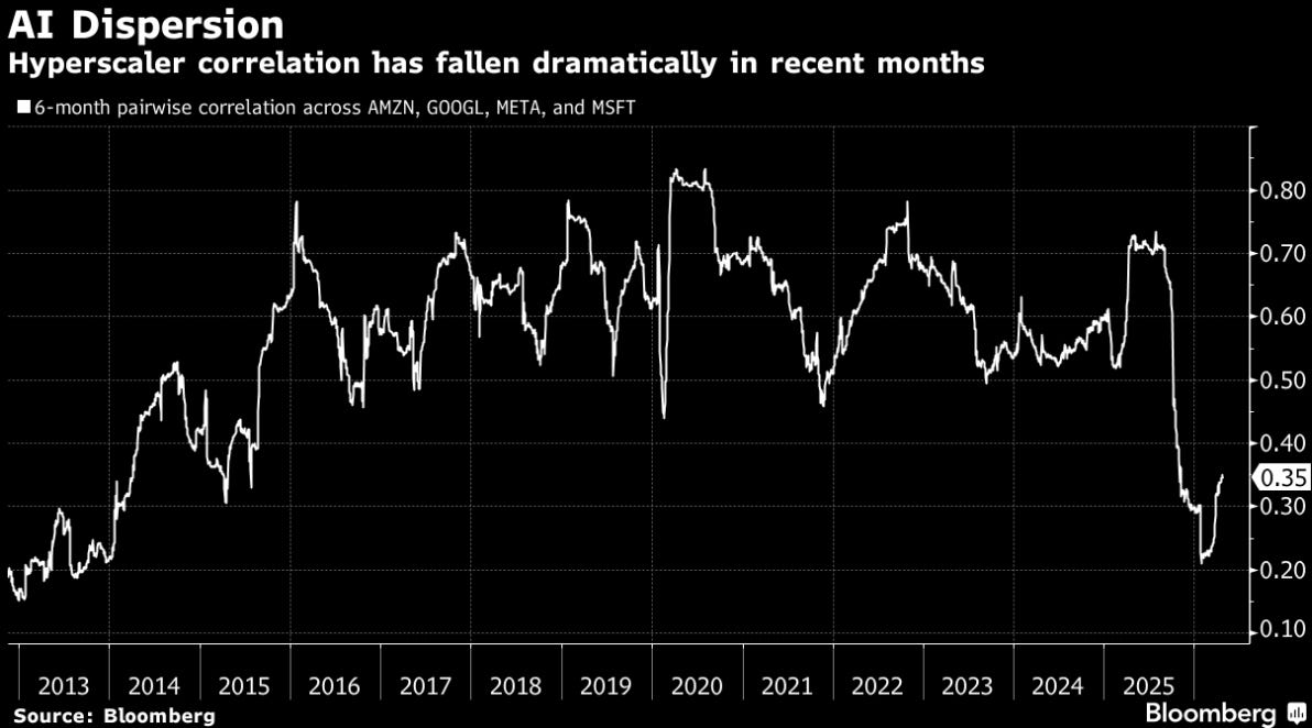
Implication: You can no longer be long “AI exposure” as a factor. You have to be right on the specific company. This also means dispersion vol is the trade — long individual names via options rather than basket hedges. The single-stock picker’s market is back.
2. Allied Defense Spending (Chart 2) — The Rearmament Supercycle Is Accelerating
Germany and Japan are the standout stories — near-vertical ramps into 2025–2026. Germany crossed ~$100B (nearly doubling in 3 years), Japan accelerating rapidly off a low base. This is a decade-long structural spend shift, not a cyclical bump.
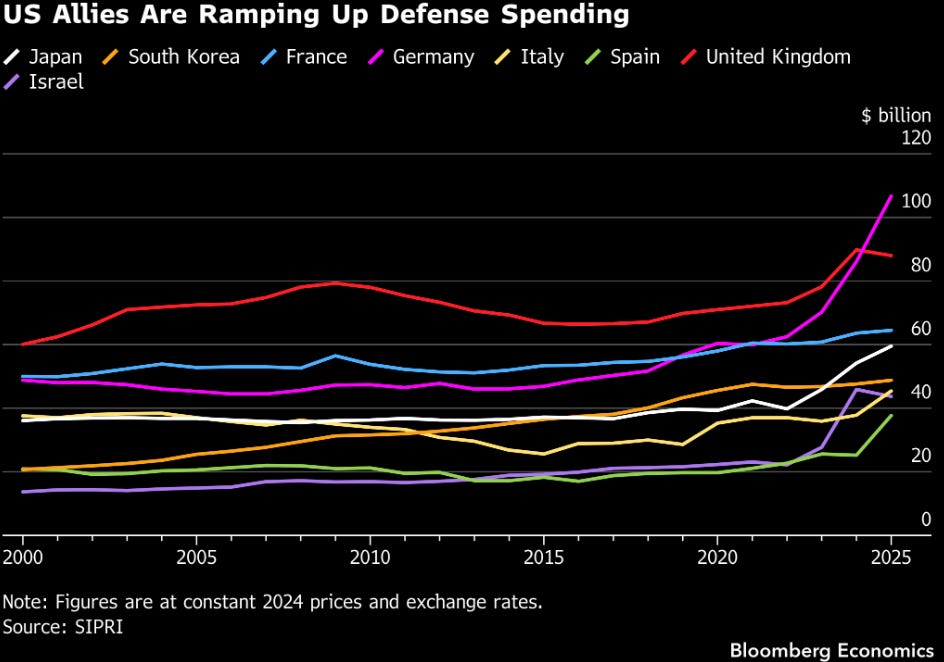
Implication: Defense primes (RTX 0.00%↑, LMT 0.00%↑, NOC 0.00%↑, BAES.L, Rheinmetall) and European defense ETFs (NATO proxy plays) remain multi-year longs. The market has partially priced this but the duration of the spend is underappreciated. This is 10-year capex commitments, not 2-year. My personal favorite way to play the European Rearmament is EUAD 0.00%↑ (Euro Defense ETF).
3. Europe Jet Fuel Supply Shift (Chart 3) — Energy Supply Chain Rewiring in Real Time
European jet fuel/kerosene imports show Middle East supply cratering in April (barely ~100K bbl/day vs. 300K+ earlier) with North America filling the gap at ~200K bbl/day. This is almost certainly Iran sanctions/Hormuz disruption driven. Another win for the US and the Trump Admin.
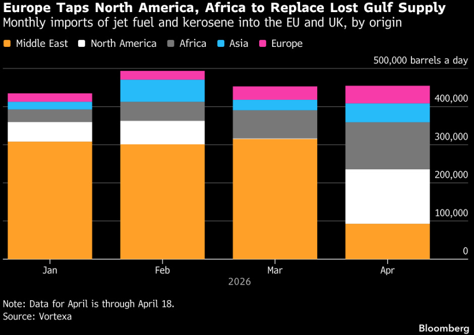
Implication: The Hormuz choke-point risk is real and already showing in physical flows. This is not priced in airline operating costs, and it’s bullish for US refined product exporters VLO 0.00%↑, MPC 0.00%↑ and LNG shippers. European energy security premium is rising.
4. Core Capital Goods Orders (Chart 4) — Capex Surge, But Read It Right
March 2026 core capital goods orders (ex-aircraft, ex-military) surged ~3.5% MoM — the biggest print since COVID. This looks bullish on the surface, but context matters: this likely reflects front-loading ahead of tariffs, not genuine organic demand expansion.
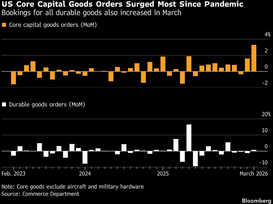
Implication: Don’t read this as a capex cycle inflection. It’s a pull-forward. The second derivative will likely turn negative in Q2–Q3 as the front-loading exhausts and tariff uncertainty paralyzes forward commitments. I’d watch the next 2–3 prints closely. Industrial machinery and equipment names could give back recent gains.
5. Stock-Bond Correlation (Chart 5) — The Most Dangerous Chart in the Deck
The S&P 500 / Treasury return correlation has flipped positive and is now running near +0.15 to +0.20 — a regime that has historically only persisted during inflationary supply shocks (1970s, 2022). The traditional 60/40 hedge is broken. Bonds don’t protect when stocks sell off in an inflation regime.
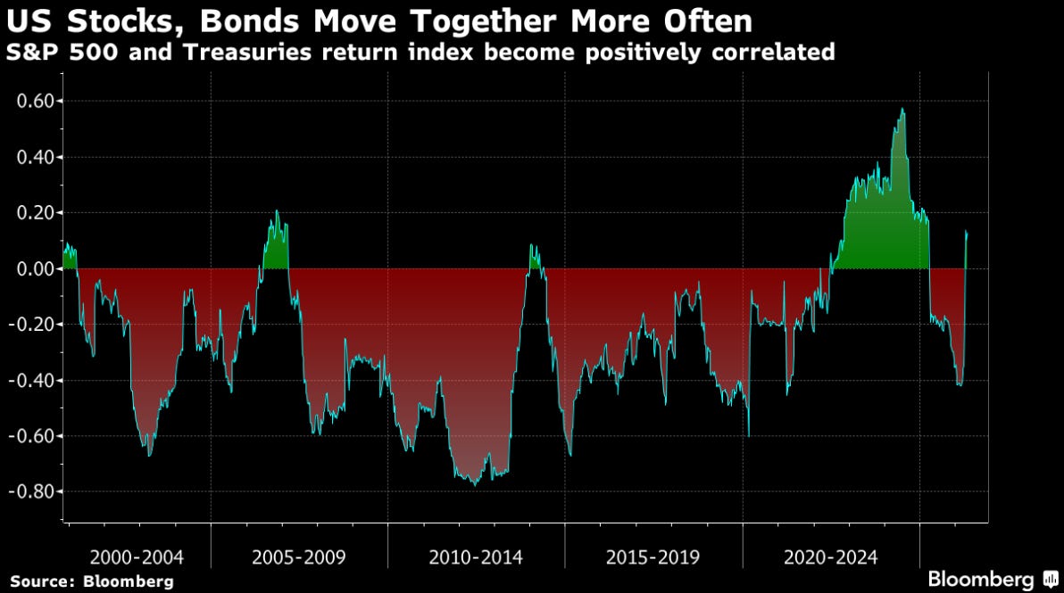
Implication: This validates my personal “Broken 60/40” thesis and it means the Fed is pinned — cutting into an inflation scare kills the bond rally and doesn’t help equities. Gold, commodities, real assets, and short duration are the only clean hedges. This chart alone justifies a significant portfolio construction shift.
6. Housing Starts (Chart 6) — Positive Surprise, But Tariff Shadow Looms
Total housing starts hit 1.5M SAAR — the best in over a year, with single-family at ~1.0M. This is a genuine beat and signals that builders are getting ahead of expected tariff-driven lumber/materials cost increases.
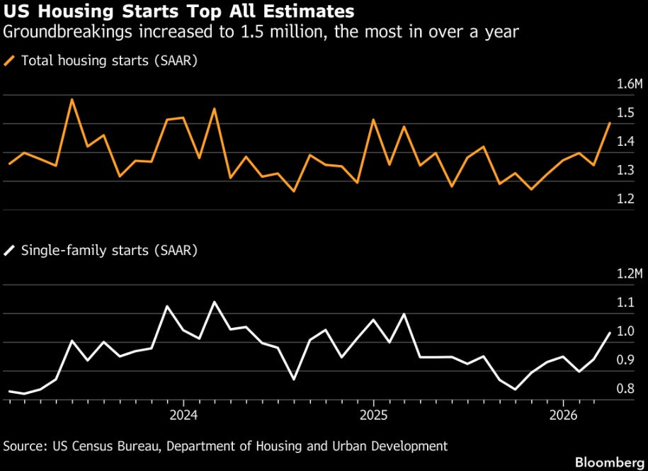
Implication: Same dynamic as capex orders — likely a pull-forward, not a trend. Lumber futures and homebuilder stocks DHI 0.00%↑, LEN 0.00%↑, NVR 0.00%↑ may have a near-term ceiling as this front-loading exhausts. The real question is mortgage rate trajectory — if the stock/bond positive correlation persists, rate relief is not coming, which chokes off sustained housing demand.
7. USD/JPY and BoJ Intervention (Chart 7) — Japan at 160, No Intervention Yet
Dollar-yen is back near 160 in 2026 — the same level that triggered massive BoJ intervention in 2024 (¥5.62T and ¥5.92T interventions). Critically, no intervention has occurred yet at this level despite the yen sitting right at the prior trigger zone.
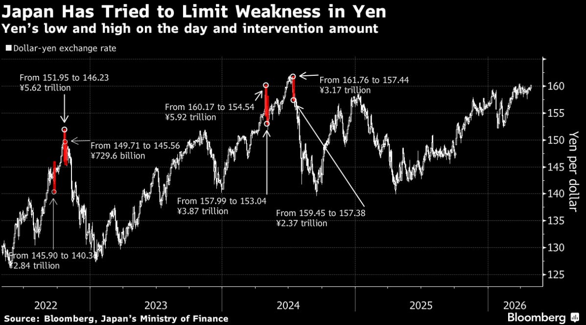
Implication: Either (a) the BoJ has decided to tolerate more weakness given US tariff/trade dynamics, or (b) intervention is imminent and the risk/reward on USD/JPY is capped at current levels. For a US macro book, this matters because yen weakness = dollar strength, which is a headwind for EM and commodities priced in USD. We should all watch for a coordinated G7 FX statement — that would be the catalyst for a sharp yen snap-back.
Synthesis: The Big Picture
AI Dispersion Collapse — Late-cycle differentiation, monolith trade over
Defense Ramp — Multi-year structural, not cycle-dependent
Jet Fuel Rerouting — Hormuz risk real, energy supply chain fracturing
Capex Surge — Front-loading, not organic — second derivative turns
Stock/Bond Correlation Positive — Inflationary regime, 60/40 broken
Housing Beat — Pull-forward, rate-dependent sustainability
USD/JPY Near 160, No Intervention — Intervention risk building, dollar cap forming
Bottom line: It appears we are in a late-cycle inflationary supply shock regime with geopolitical overlays compressing traditional hedges. The plays are: long real assets/energy/defense, short the 60/40 assumption, be selective (not basket) in AI, and watch USD/JPY as the canary for FX intervention risk.
Disclaimer: This is for educational purposes only. NFA.