
I Asked an AI to Draw the Stock Market. It Gave Me Stained Glass
Why the market isn't a math problem—it's a stained glass window

“There are surely patterns in the market... but they are faint, and they are overlaid with a tremendous amount of noise.”
— Jim Simons
I was reading a technical blog post from Jane Street recently (yes, the massive trading firm that prints money), and they shared something fascinating: a way to visualize how Neural Networks actually “think.”
It turns out, these complex AI models don’t just see a blur of numbers. They carve the world into distinct geometric shapes—like a shattered pane of glass.
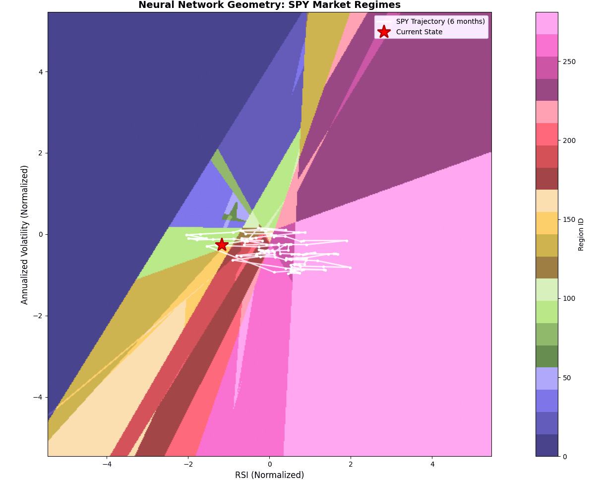
Inspired by their research, I decided to run an experiment. I built my own neural network, fed it two years of SPY 0.00%↑ S&P 500 data (Price, Volatility, RSI), and asked it to draw a map of the current market.
I didn’t want a prediction. I wanted to see the geometry.
Here is the result.
The “Geometry” Explained (Simply)
You are looking at a “Regime Map.”
Most people think the stock market follows one big, complicated formula. But this map proves that isn’t true. The market is actually a patchwork of thousands of tiny, simple rules stitched together.
The Polygons (Shapes): Every colored shape is a different “Market Regime.” Inside each shape, the market follows a specific set of rules.
The Edges (Lines): These are the tipping points. When the market crosses a line, the rules flip. Strategies that worked yesterday suddenly stop working today.
Think of it like a stained glass window. If you are standing in a Blue Shard, the light is blue. Step one inch to the right into a Gold Shard, and the light is suddenly gold. The market works the same way.
The Two Big Reveals: Space vs. Time
This is where it gets cool. We can measure two things: what the AI thinks could happen (The Map), versus what actually happened (The Path).
1. The Map: The AI is an Optimist If you look at the total area of the colors, the AI has a structural bias:
40% is “Light Pink” (Bullish Trend). The AI assumes that in most scenarios, stocks go up.
Only ~5-7% is “Dark Blue” (Crash/Panic). It knows crashes exist, but it relegates them to a tiny corner of the universe.
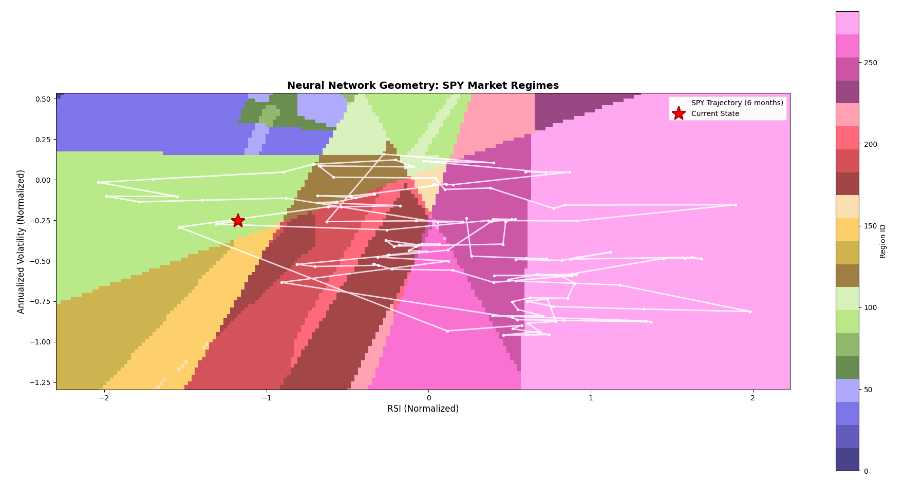
2. The Path: We Are Stuck in the Mud Now, look at the white scribble in the middle. That is the actual path of the S&P 500 over the last 6 months.
Where we live: We spent ~35% of our time in that “Dark Red/Maroon” strip. That isn’t a crash, and it isn’t a rally. It’s compression—just chopping back and forth.
Where we don’t go: We spent less than 5% of our time in the “Stress Zones” (Blue/Indigo).
The “Resilience” Secret (For Investors)
This geometry reveals a hidden secret about why “time in the market” beats “timing the market.”
Notice how “sticky” the white line is? It loops back on itself constantly. It doesn’t break down; it snaps back to the middle.
What this means: Pullbacks are fast and temporary. The market takes a hit, shakes it off, and returns to the “boring” grind upwards.
The Mistake: Moving to cash to “wait for the crash.” You are sacrificing compounding to protect yourself against a “Blue Zone” event that almost never actually happens.
The Play: The map shows that the market spends 70%+ of its time in the “Growth” and “Compression” zones. The geometry favors staying the course. When the white line dips into the scary colors, it’s usually a signal to buy, not to run.
The Verdict
The geometry tells us the market is structurally anxious but behaviorally stable.
We are doing laps in the “boring middle.” The map shows us that a “Crash Regime” is always sitting right there in the corner, waiting for us to cross the line—but for the last six months, we’ve refused to take the bait.
The takeaway? Don’t trade as if the rules are permanent. In this shattered center, the rules change every few days. Stay nimble.
Disclaimer: This is for educational purposes only. I just like teaching robots to paint.
The stained-glass metaphor for regimes is a nice one. And that white scribble could help me track my reversals, perhaps.